T A N T R U M
Reshaping Perspectives for a Friendlier In-Store Shopping Experience
The focus was on optimizing the experience of . 's current website. We conducted a comprehensive analysis of the webpage, with a careful evaluation of both its strengths and weaknesses. The goal was to transform the user's journey into one that is not only enjoyable but also intuitive and highly interactive.
Duration
3 weeks
October 2023
Client
Team
Solo Project
Tools
Figma
Google Workspace
Photoshop
Invisible Strenghts
Reshaping Perspectives
I focused on optimizing 's website by analyzing its strengths and weaknesses to create a more intuitive, enjoyable, and interactive user experience.
Prototype
T A N T R U M
Duration
Team
Tools
Client
Figma
Google Workspace
Photoshop
3 weeks
Invisible Strengths
Solo Project
Invisible Strengths
What is Tantrum?
What is Tantrum?
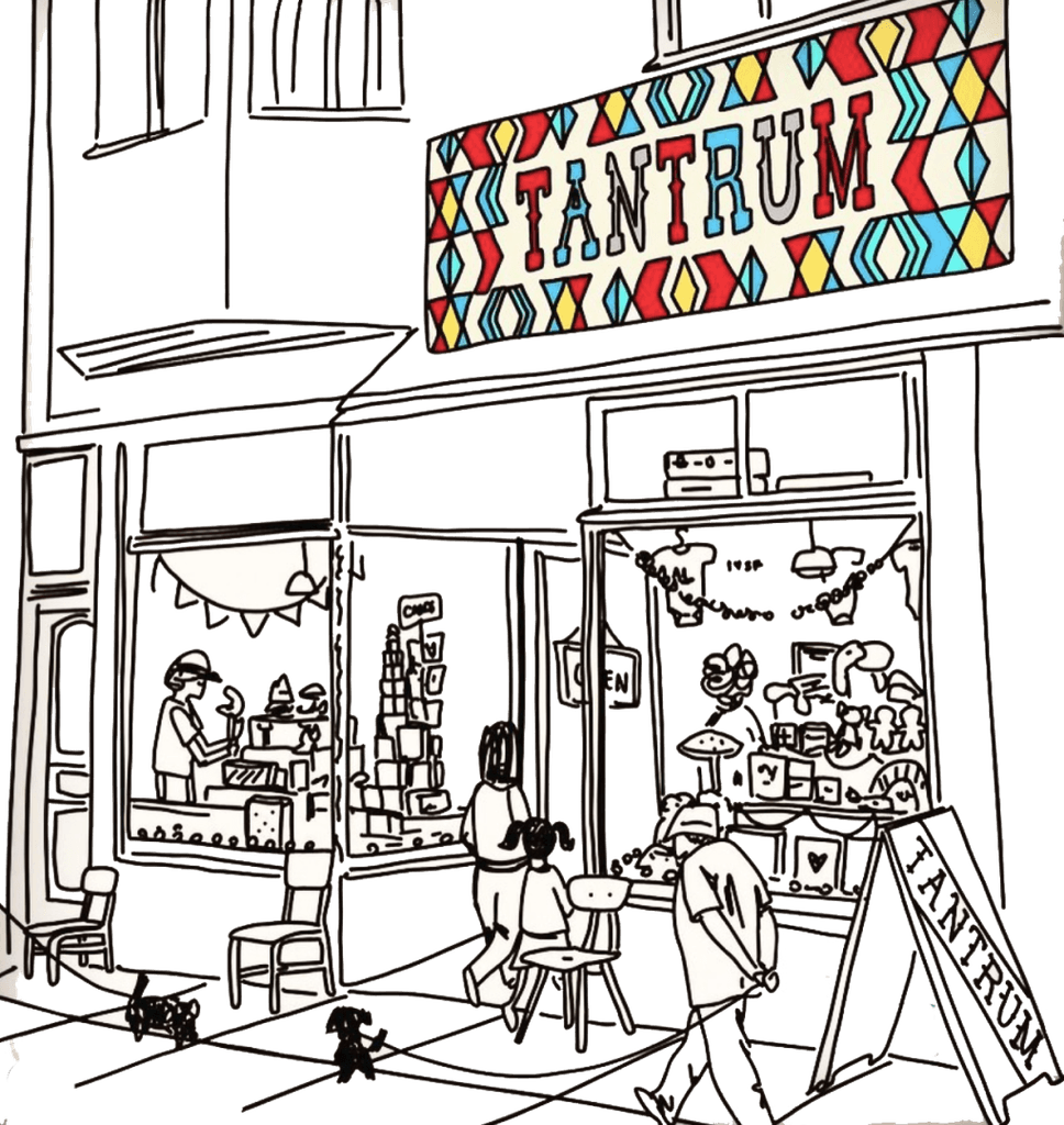
Tantrum is a store for kids with a sophisticated style and timeless playfulness. Its distinctive character emanates from the unique blend of classic mid-century style and the finest handmade toys of today.
Tantrum is a store for kids with a sophisticated style and timeless playfulness. Its distinctive character emanates from the unique blend of classic mid-century style and the finest handmade toys of today.

How can we
How can we
enhance the user's journey from product discovery to a seamless and efficient checkout process?
enhance the user's journey from product discovery to a seamless and efficient checkout process?
Challenge
The design approach centers around enhancing the user's journey by providing intuitive product discovery features and optimizing the checkout process for maximum user satisfaction and efficiency.
Challenge
The design approach centers around enhancing the user's journey by providing intuitive product discovery features and optimizing the checkout process for maximum user satisfaction and efficiency.
Our goal is to uncover both user pain and joy points within the online purchasing journey in the actual page. To achieve this, we leveraged various tools and methods to arrive at meaningful insights and results.
Our goal is to uncover both user pain and joy points within the online purchasing journey in the actual page. To achieve this, we leveraged various tools and methods to arrive at meaningful insights and results.
Interviews + User Usability + Feature Analisis
Interviews + User Usability + Feature Analysis
What users have conveyed
What users have conveyed
In our initial interview and first usability test, we gained a fundamental understanding of TANTRUM's current website.
In our initial interview and first usability test, we gained a fundamental understanding of TANTRUM's current website.
Users highlighted the need for a fast, user-friendly shopping experience with clear images and detailed descriptions. In testing the TANTRUM webpage, they found it disorganized, especially the confusing menu bar, though the payment process was straightforward but could benefit from more payment options.
Users highlighted the need for a fast, user-friendly shopping experience with clear images and detailed descriptions. In testing the TANTRUM webpage, they found it disorganized, especially the confusing menu bar, though the payment process was straightforward but could benefit from more payment options.
We uncovered valuable insights to enhance our own offerings
We uncovered valuable insights to enhance our own offerings
Our focus is primarily on addressing the following key points:
Homepage Enhancement: Improve the homepage with depth and exploration options inspired by other platforms.
Visual Aids: Introduce visual aids for easier navigation and an enhanced user experience.
Navigation Simplification: Streamline homepage navigation for a more intuitive and less confusing user interface.
Filtering and Categorization: Implement filters and categorize products to empower users in their search and discovery.
User Engagement: Enhance user engagement by adding a favorites section, user reviews, and social media elements for valuable insights and trust-building.
Joy Point
Pain Point
-The concept of the online store serves as a foundational element shaping the overall user experience on the current webpage.
-Strategic use of brand colors enhances the visual experience.
-The implementation of a user-friendly and streamlined checkout and payment process.
-Information lacks organization, making it difficult for users to grasp.
-Challenges in comprehension result from disorganized content.
-The content lacks depth and exploration options, limiting user engagement.
-Navigation proves to be challenging for users.
-There is a need for improved interaction with the user to enhance the overall user experience.
Joy Point
-The concept of the online store serves as a foundational element shaping the overall user experience on the current webpage.
-Strategic use of brand colors enhances the visual experience.
-The implementation of a user-friendly and streamlined checkout and payment process.
Pain Point
-Information lacks organization, making it difficult for users to grasp.
-Challenges in comprehension result from disorganized content.
-The content lacks depth and exploration options, limiting user engagement.
-Navigation proves to be challenging for users.
-There is a need for improved interaction with the user to enhance the overall user experience.
Behaviors: Shops online monthly for her child's development.
Frustrations: Unclear and complicated websites.
Needs: She seeks user-friendly interfaces, detailed product information, and quick searches.
Goal: An organized and user-friendly webpage designed for efficiency and ease of understanding.
Tech-savvy mom from San Francisco


Behaviors: Shops online monthly for her child's development.
Frustrations: Unclear and complicated websites.
Needs: She seeks user-friendly interfaces, detailed product information, and quick searches.
Goal: An organized and user-friendly webpage designed for efficiency and ease of understanding.


Sarah faced challenges with an inefficient research process, a lack of clear website information, and limited multimedia content for effective decision-making.
Sarah faced challenges with an inefficient research process, a lack of clear website information, and limited multimedia content for effective decision-making.
HMW might we create a more user-friendly shopping experience with organized and clear information that seamlessly integrates multimedia content, streamlines product comparison, and optimizes search and filtering functionalities?
HMW might we create a more user-friendly shopping experience with organized and clear information that seamlessly integrates multimedia content, streamlines product comparison, and optimizes search and filtering functionalities?
During the design phase, we drew inspiration from this meaningful quote “Like a big top of yore, the bright colors and bold graphics of Tantrum entice you to enter the spectacle of wonders within", which serves as the cornerstone of our company's vision, shaping the essence and purpose of the brand. This quote guided our user experience design journey, enabling us to create a brand that resonates with the actual store's audience and aligns with their values.
During the design phase, we drew inspiration from this meaningful quote “Like a big top of yore, the bright colors and bold graphics of Tantrum entice you to enter the spectacle of wonders within", which serves as the cornerstone of our company's vision, shaping the essence and purpose of the brand. This quote guided our user experience design journey, enabling us to create a brand that resonates with the actual store's audience and aligns with their values.
Goal: Facilitate a seamless and user-friendly product purchase experience, ensuring that users can acquire the desired item quickly and with a pleasant, efficient process.
Goal: Facilitate a seamless and user-friendly product purchase experience, ensuring that users can acquire the desired item quickly and with a pleasant, efficient process.


About Us
Products General
Products
General + Filter
Products Specific
Cart
Home Page







Show Storie
Add Social Media
All the Products
Products Sele-
cted by Filter
All that we are getting
Show specific
information and reviews of
the product
Simplify Menu
Images Products
Check Out
Clear
Check Out
About Us
About Us
Products General
Products
General + Filter
Products
General + Filter
Products Specific
Cart
Pay
Home Page


Show Storie
Add Social Media
All the Products
Products
Selected
by Filter
Products Selected
by Filter
All that we are getting
All that we are getting
Show specific
information and reviews of
the product
Simplify Menu
Images Products
Check Out
Clear
Check Out


Cart
Check Out
Clear
Check Out
Products General
Style Guide
Style Guide
The idea was to preserve the core essence of the brand, maintaining its primary colors, aesthetics, name, and logo. Our goal was to streamline the design for a cleaner and more user-friendly webpage.
The idea was to preserve the core essence of the brand, maintaining its primary colors, aesthetics, name, and logo. Our goal was to streamline the design for a cleaner and more user-friendly webpage.
Brand Logo



Heading
Font size: 18-40px
Corner Radius: 20
Text
#646361
#D9663D
#F2EFE
Colors
#D95D41
Typography - Lato
Title/Heading
Icons
#F2B950
Action Icons
Text input


#646361
#D9663D
#F2EFE
Heading
Heading
Font size: 18-40px
Font size: 18-40px
Brand Logo
Colors
#D95D41
Typography - Lato
Typography - Lato
Title/Heading
Corner Radius: 20
Corner Radius: 20
Text


Icons


Action Icons
Action Icons

Text input
#F2B950

#646361
#D9663D
#F2B950
In our initial wireframe, the brand identity has been integrated into our sketches with the aim of building a webpage that can be tested for usability and gather valuable user feedback.
In our initial wireframe, the brand identity has been integrated into our sketches with the aim of building a webpage that can be tested for usability and gather valuable user feedback.
New
Old
Old
About Us
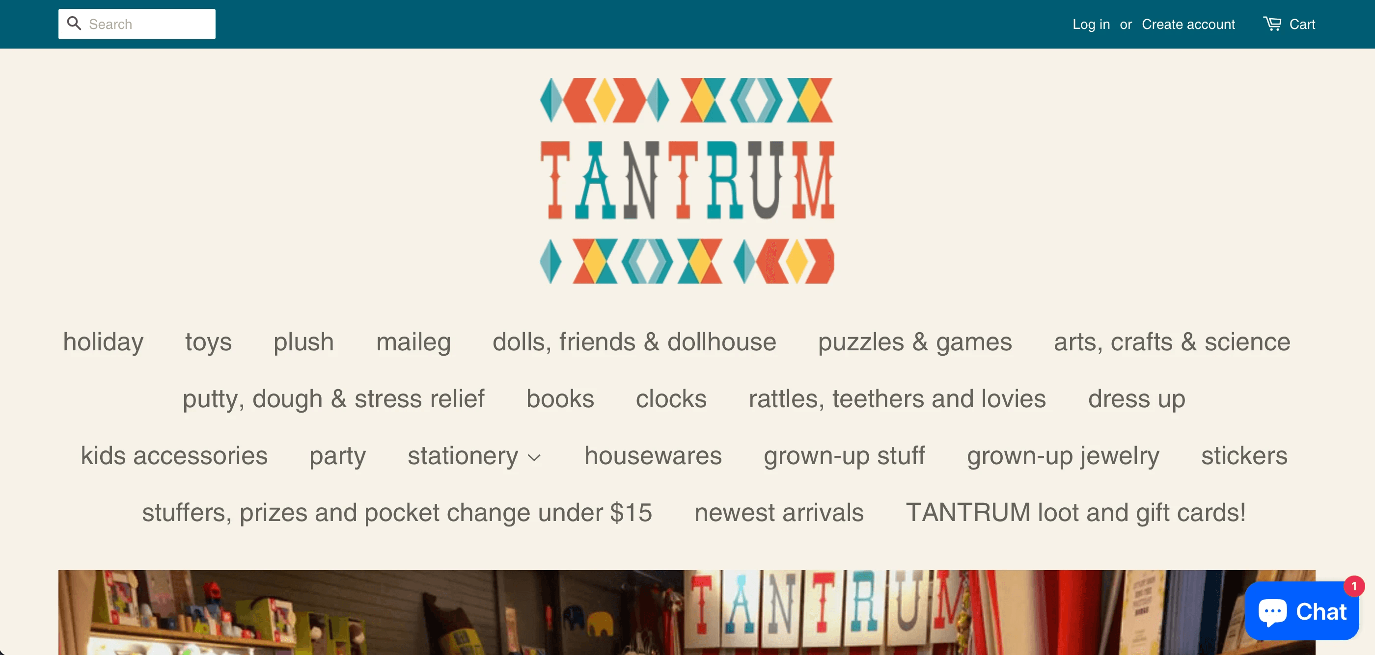
The menu of the page presented a challenge, as it initially overwhelmed users upon opening, obstructing their view of other page elements. To address this issue, we conducted a card sort activity, wherein we had five users categorize the titles into three main groups. This approach simplified and decluttered the page, enhancing the user experience.

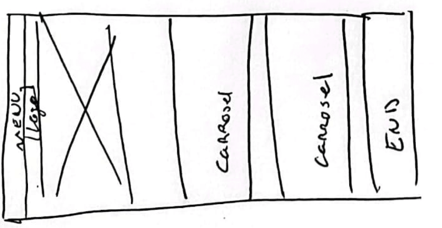
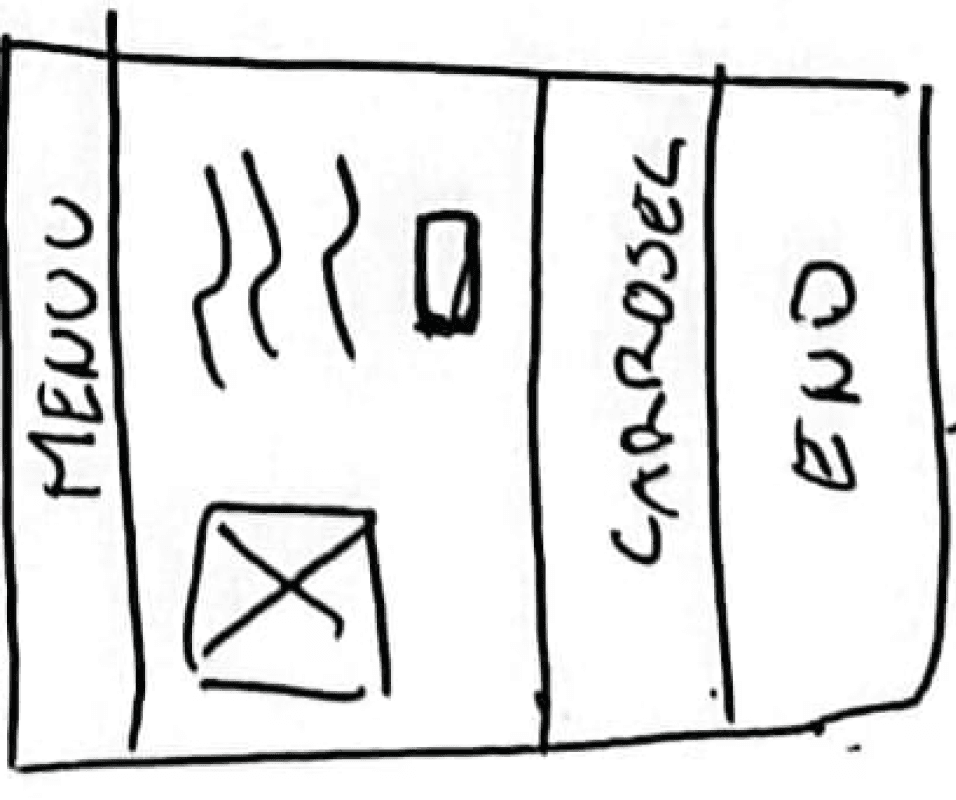
In the previous version of the website, the main content in the body section was limited to just a single image. This prompted us to revamp the homepage by introducing various sections where products could be showcased, allowing users to easily navigate and explore the different offerings available in the store. Additionally, we included a dedicated area for customer reviews, enhancing the authenticity of the shopping experience.
Home Page
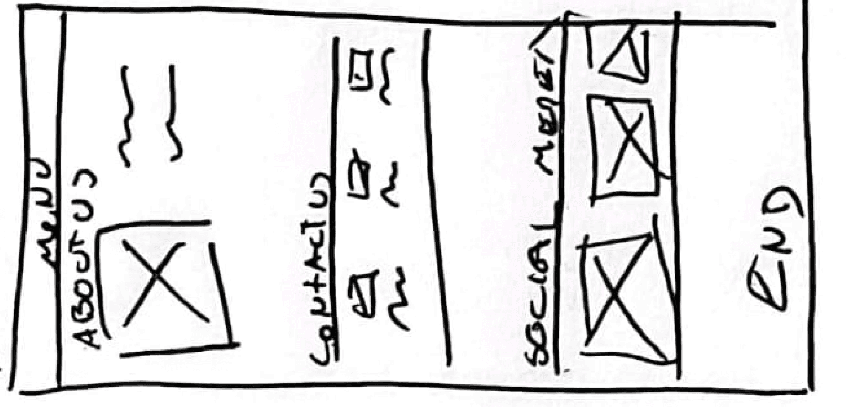
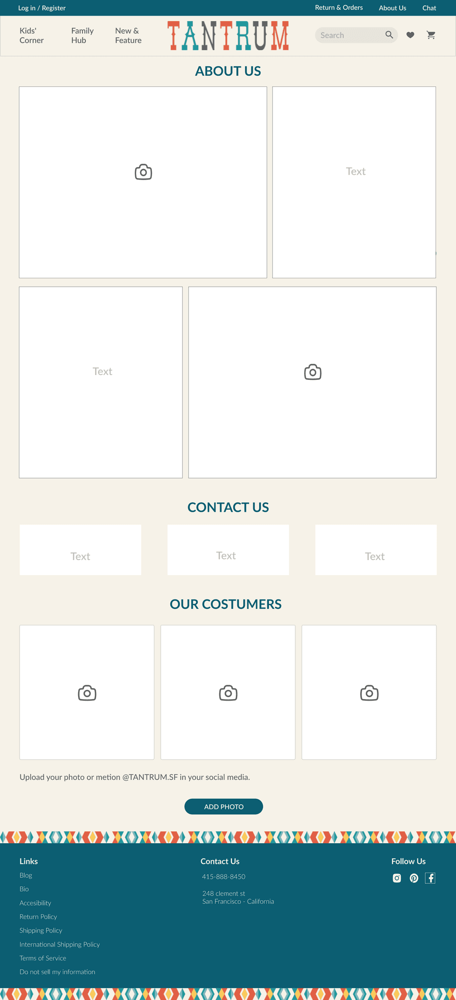
We introduced a new "About Us" page to consolidate store information that was previously scattered across various pages. This central location enhances user convenience, providing a comprehensive and streamlined source of details for a more cohesive and user-friendly experience.
We added a section titled "Our Customers," encouraging users to share images of themselves using our products. Additionally, we integrated curated photos from different platforms where users have tagged us. The goal is to foster a sense of familiarity and homeliness, creating a more personalized and community-driven experience on the webpage.

New
Products / General
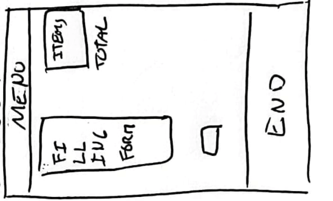
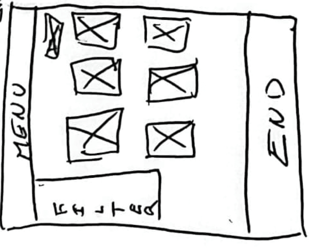
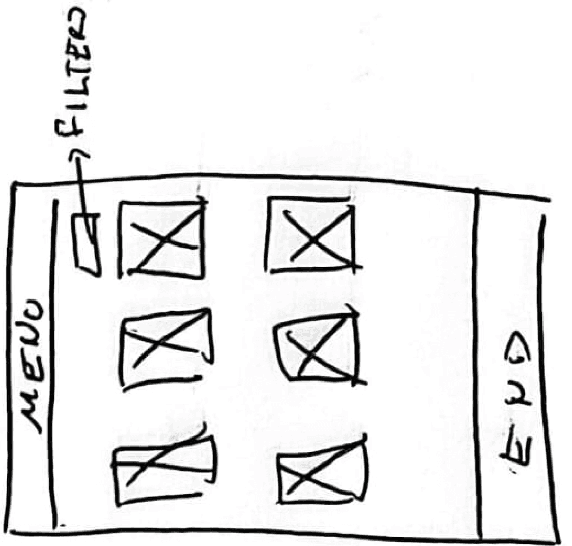
On this page, we initially encountered minimal issues, with the aim of optimizing the user's activity and delivering the best experience. The menu was revamped, more space was allocated for prominent product images, and the ability to add items directly to the shopping cart, or favorites, was introduced. Additionally, we implemented a convenient filtering feature to streamline the product-finding process.
Products / Specific
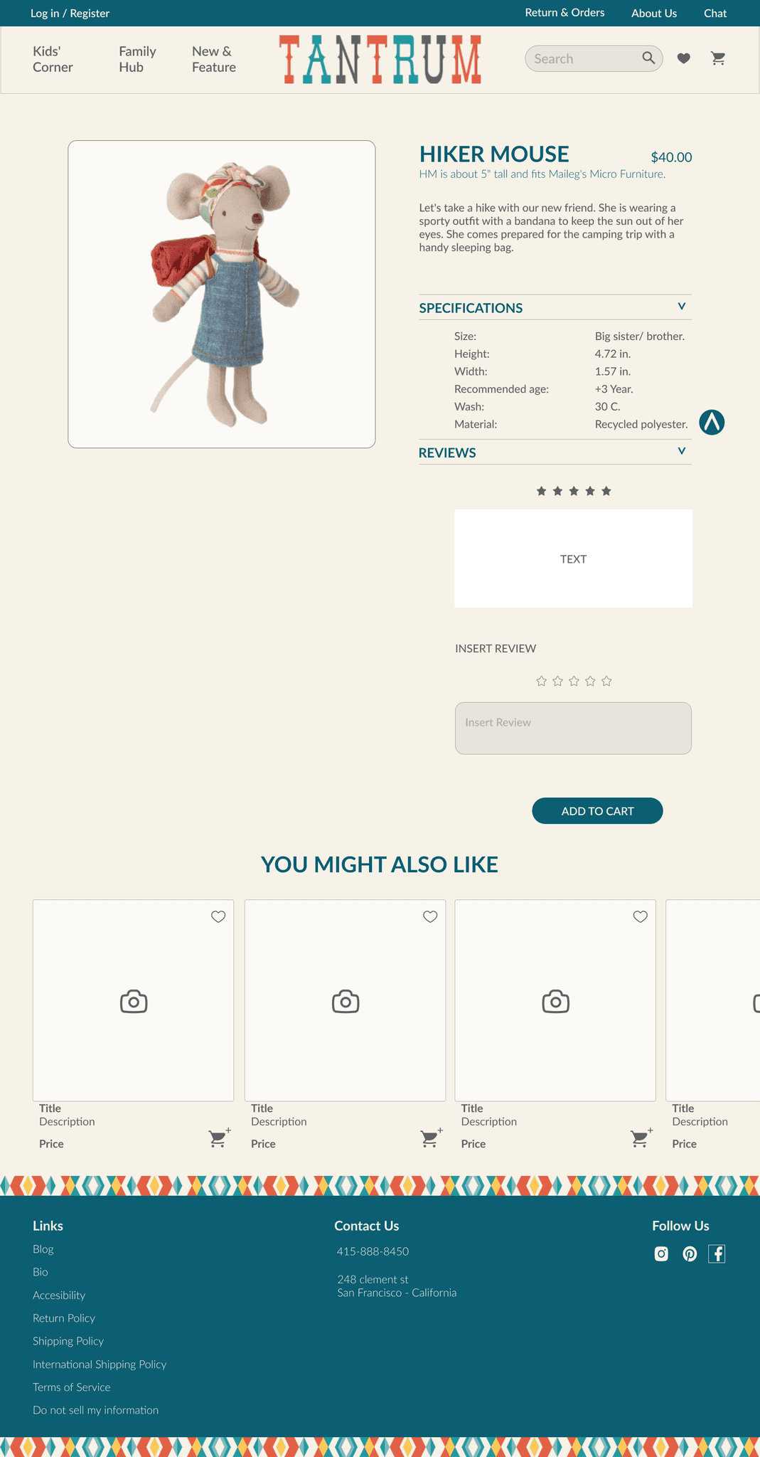
The changes on this page were minimal as there were no significant issues or user struggles to address. The primary concern was the menu, which we successfully resolved to prevent user confusion.
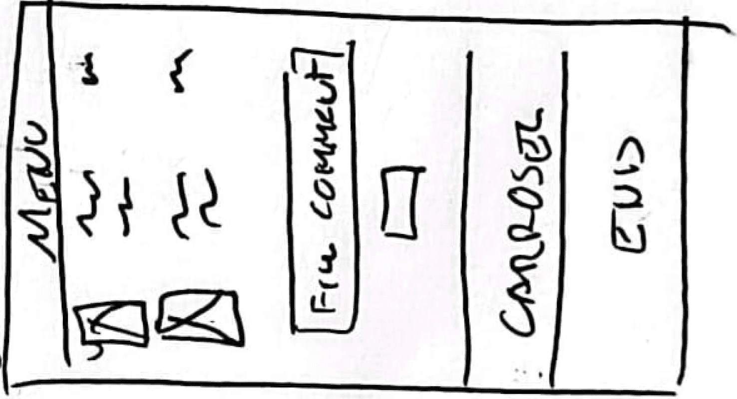
We introduced an area for product specifications with a drop-down, a dedicated section for user reviews related to the specific toy, and the ability for users to leave their own reviews. Finally, we implemented a pop-up confirmation for product acquisition, along with the option to adjust the quantity of the selected item.
New
Old
Cart & Pay
New
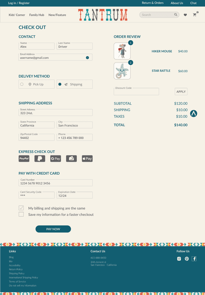
In the evaluation of these two pages, we observed that the user was generally satisfied with the content and found the checkout and payment processes to be intuitive and familiar. The goal is to retain the existing process while continually seeking opportunities for improvement to enhance the overall user experience.


Old
Old

New
The menu of the page presented a challenge, as it initially overwhelmed users upon opening, obstructing their view of other page elements. To address this issue, we conducted a card sort activity, wherein we had five users categorize the titles into three main groups. This approach simplified and decluttered the page, enhancing the user experience.
In the previous version of the website, the main content in the body section was limited to just a single image. This prompted us to revamp the homepage by introducing various sections where products could be showcased, allowing users to easily navigate and explore the different offerings available in the store. Additionally, we included a dedicated area for customer reviews, enhancing the authenticity of the shopping experience.
Home Page


Old
New
We introduced a new "About Us" page to consolidate store information that was previously scattered across various pages. This central location enhances user convenience, providing a comprehensive and streamlined source of details for a more cohesive and user-friendly experience.
We added a section titled "Our Customers," encouraging users to share images of themselves using our products. Additionally, we integrated curated photos from different platforms where users have tagged us. The goal is to foster a sense of familiarity and homeliness, creating a more personalized and community-driven experience on the webpage.
About Us
Products / General
On this page, we initially encountered minimal issues, with the aim of optimizing the user's activity and delivering the best experience. The menu was revamped, more space was allocated for prominent product images, and the ability to add items directly to the shopping cart, or favorites, was introduced. Additionally, we implemented a convenient filtering feature to streamline the product-finding process.
Old
New
Products / Specific
The changes on this page were minimal as there were no significant issues or user struggles to address. The primary concern was the menu, which we successfully resolved to prevent user confusion.
We introduced an area for product specifications with a drop-down, a dedicated section for user reviews related to the specific toy, and the ability for users to leave their own reviews. Finally, we implemented a pop-up confirmation for product acquisition, along with the option to adjust the quantity of the selected item.
Old
New
Cart & Pay
In the evaluation of these two pages, we observed that the user was generally satisfied with the content and found the checkout and payment processes to be intuitive and familiar. The goal is to retain the existing process while continually seeking opportunities for improvement to enhance the overall user experience.
Old
New
Usability Test.
Usability Test.
After conducting the usability test, it was gratifying to observe that our users successfully accomplished tasks without any project-related uncertainties. However, in the perpetual pursuit of refinement, we've pinpointed areas for enhancement:
Optimize text size for improved legibility.
Evaluate and optimize the placement of pop-ups to enhance user interaction.
Fine-tune or remove certain icons to streamline the visual experience.
Infuse greater dynamism into the checkout process for an enriched user journey.
These adjustments aim to create a more satisfying user flow by harmonizing aesthetics with functionality.
Deliver
Deliver
View Here
Returning to the core of our challenge: How might we elevate the user's journey from initial product discovery to a seamless and efficient checkout process? Indeed, we have a solution in the form of a prototype.
Home Page
About Us
Products General
Products Specific
Cart / Check Out
Home Page
About Us
Products General
Products Specific
Cart / Check Out
Home Page
About Us
Products General
Products Specific
Cart / Check Out
Home Page
About Us
Products General
Products Specific
Cart / Check Out
Conduct usability assessments to gather user feedback and understand interaction patterns.
Analyze insights to identify areas for improvement and enhance overall functionality.
Follow user-centered design principles to ensure the site evolves with users’ changing needs.